A new blog theme!
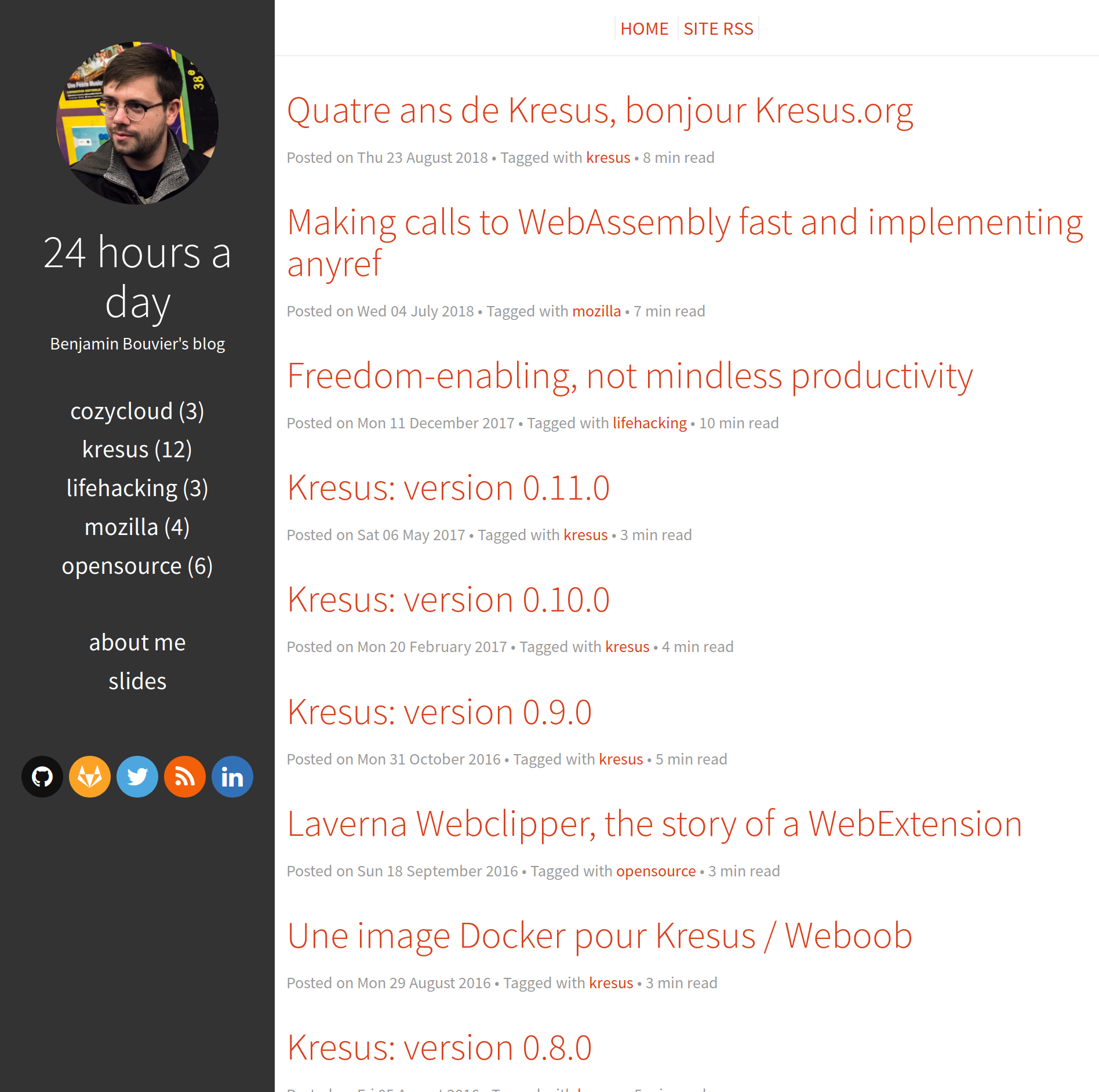
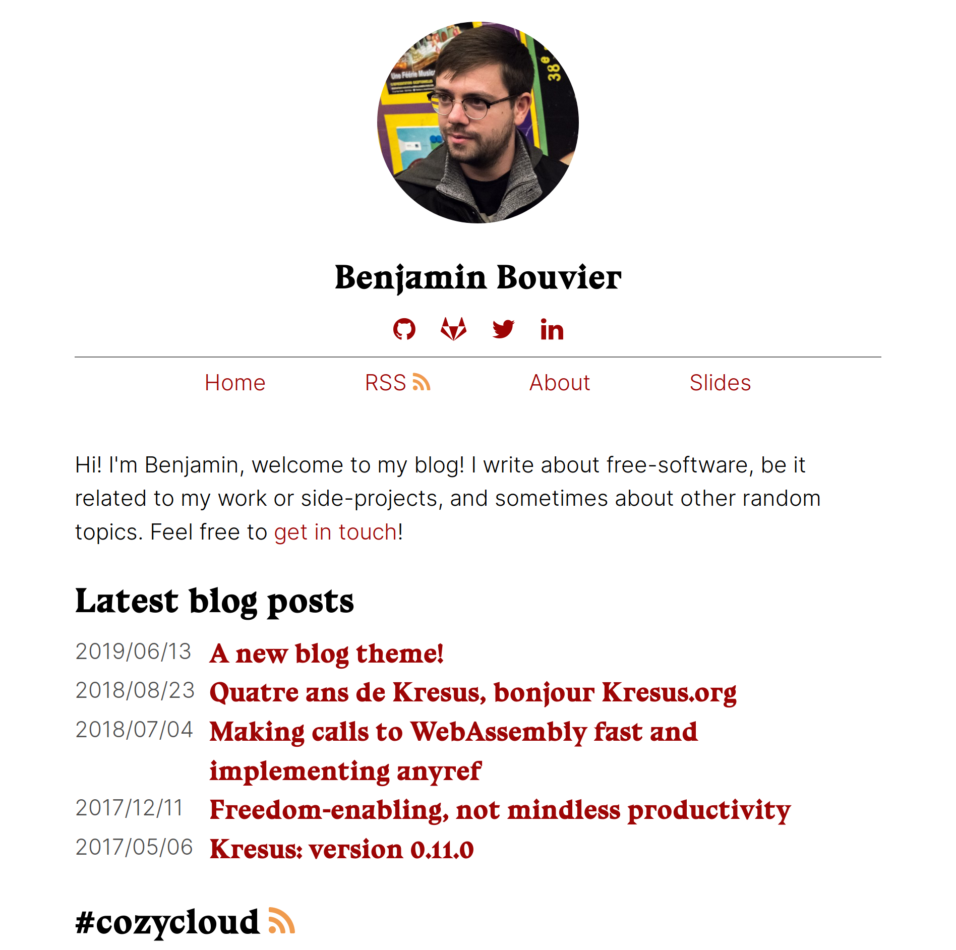
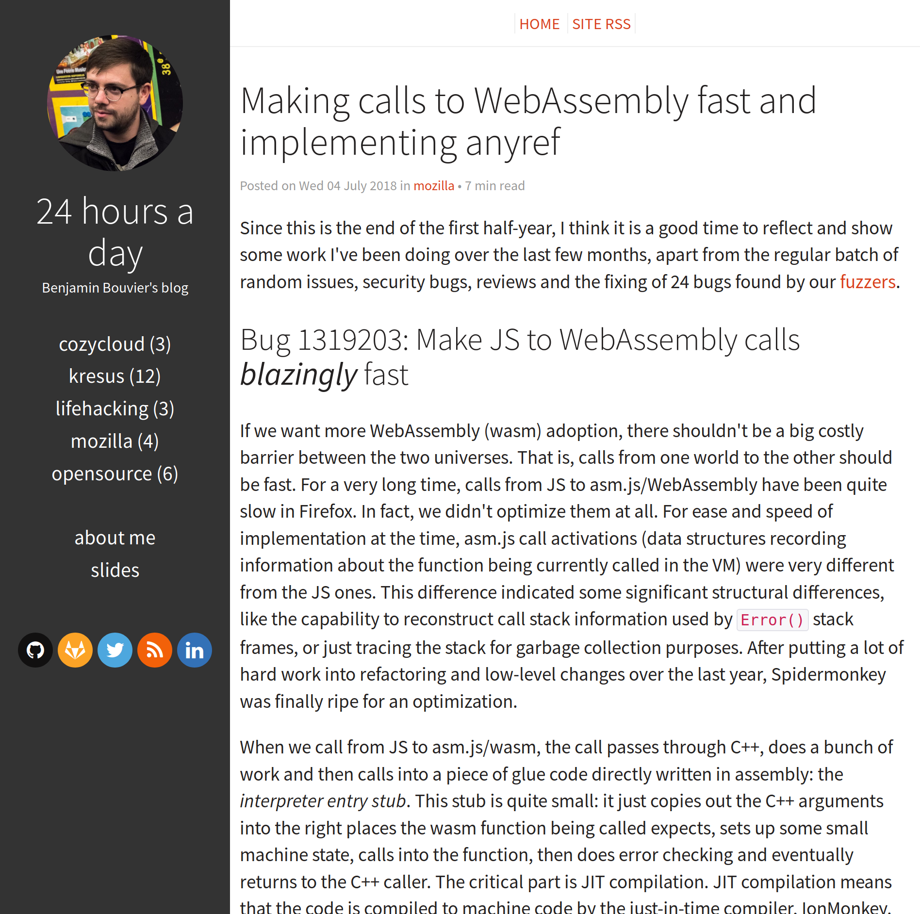
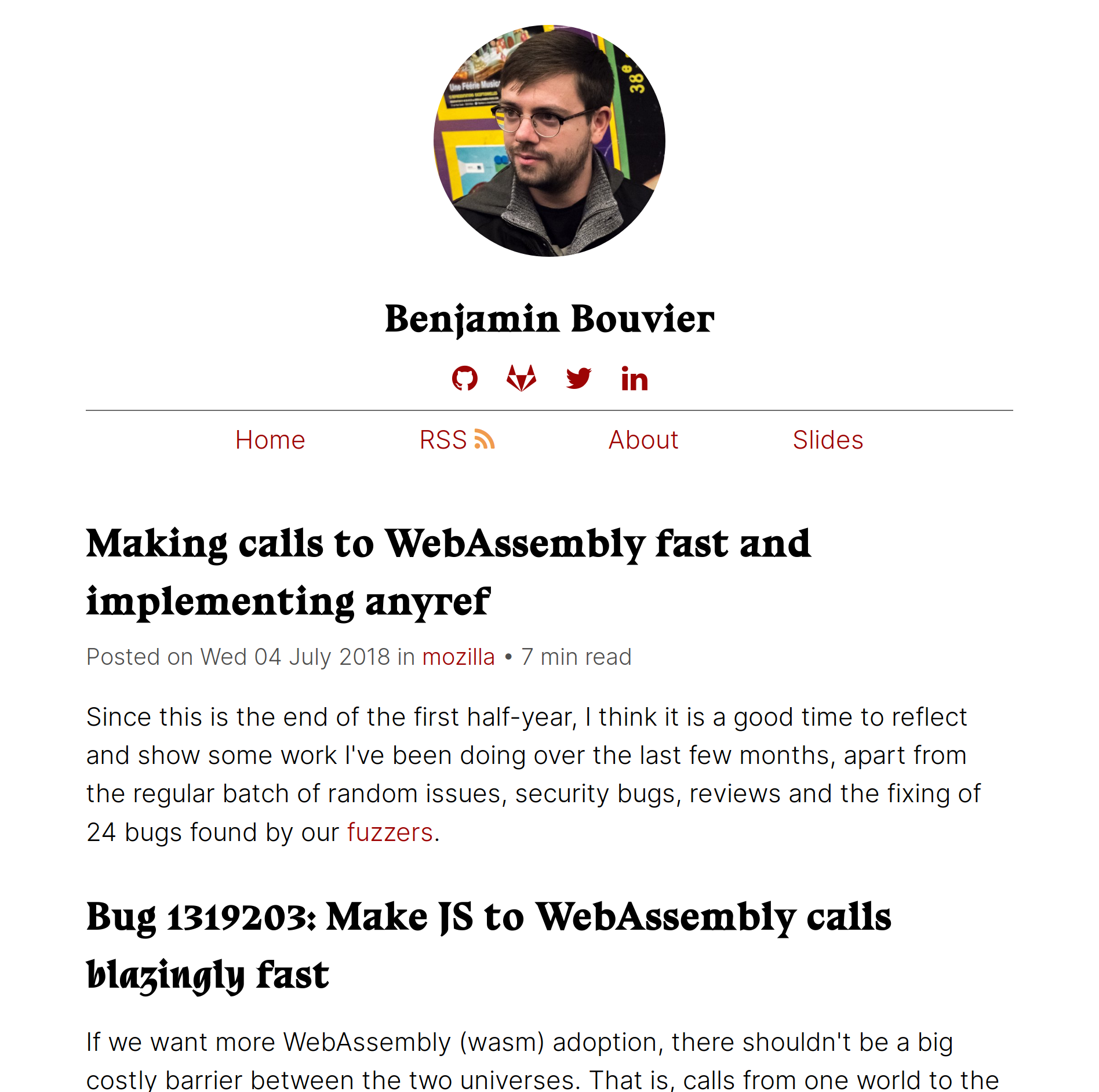
Just a quick note! I’ve just updated my blog’s design and UI so it is more convenient, modern and light. It is still using the Pelican blog system, only the theme has changed. The previous theme, Flex, was elegant and it has been quite pleasant to use, but it had a few subtle drawbacks that revealed as time went. Here I explain what were my needs, which other blog designs inspired me, and link to all the different resources I’ve used.
Embeds: tracking and comments
I use some embeds in my blog: since Pelican generates static files, it can’t handle more complicated features like counting visitors or a comment system. Soon, I’ve wanted to get a rough idea of the number of visitors and where they come from, to understand which posts are the most useful (and of course, to bless my ego). I’ve been using self-hosted, open-source systems for that purpose, like Matomo (née Piwik), because I don’t want my blog’s visitors to get (even more) tracked by Google Analytics, which would be counter to my values. This led to a meaningful contribution to add support for Matomo in the theme, so other people don’t have to redo this work themselves!
Later, I switched over to the Fathom analytics system, because it’s lighter, it knows less about my visitors (only number of visits/visitors by page and the referrer), and its dashboard is a gazillion times faster to load (all it loads are static files!) than Matomo’s. So I had to tweak the theme for this too! And then, when I decided to add an embed for a self-hosted, open-source comment system named isso (think of it as an alternative to the centralized Disqus), I needed to add support for it as well. This meant digging into the theme and understanding how it works, and each time I wanted to add a new embed, I had to repeat this process.
CSS and markup
After reading a well-written and quite interesting online class on typography on BetterWebType (read it if you haven’t! it helped me understanding why some websites were more pleasant to use, and put explanations onto all the intuitions and feelings I had on the topic), I’ve changed a few lines in the CSS source file, tweaking fonts, width, line height etc.
A few other changes affecting the markup also happened over time, for which I had to add CSS rules. Of course there were a few conflicts with preexisting rules, since that’s pretty common in CSS; but the fact that I didn’t write the CSS rules in the first place made it harder to understand how and where these rules were used.
Writing my own
I also got a bit bored of the design itself, especially the aside bar on the left which felt a bit early 2010, as well as the overall sense of density. Some other blogs’ strong takes inspired me a lot: in particular, I’d like to point to my colleague and friend Paul Adenot’s blog, and its refined, minimalistic design (as well as its amazing body font, look at the K/it or Q/uo ligatures, they’re insane). There’s also the blog of Julia Evans, which in addition to containing amazingly instructive blog posts about system programming, shows all the blog posts as a long list in the index page, making it clear, informative and helping discoverability.
With all of this in mind, since I had to acquire more control over the theme anyway and I wanted it to look much different, I decided to write my own. Of course, it’s free software. This is what you should be seeing right now.
As an extra to all the items I’ve mentioned before, I’d like to give a shoutout to the open-source fonts I’ve used. The header font is bluu, a font created by Jean-Baptiste Morizot from the fantastic Velvetyne type foundry. Go check it out if you’re a typo nerd! or if you’re looking for some original and well-thought fonts. The body font is Inter UI; it feels quite modern and it has been designed with computer screens in mind.
Previous vs new home page:


Previous vs new post page:


Flex thee well
I still think Flex is a great theme to start with, and I’m thankful to the authors for writing it in the first place, since it has served me well. Thanks!
I’d also like to thank people who gave me feedback and helped me write the CSS (me can’t CSS) of this theme, including Flaburgan, Maiwann, Marien, Thomas and other Framasoft friends.
And thank you for reading this far! I think blogging and self-hosting are still important and relevant, to avoid depending on commercial platforms, like Medium, which repeatedly tries to get you to subscribe, displays thousands of popovers and attempts to abuse your attention into reading always more (and spending more time on their website). It’s easy to host your own blog! Even if you don’t have your own server, you can use Github or Gitlab pages, with fancy automatic systems that make publishing a breeze.
I’d be curious to hear your feedback on this new design, including code improvements (remember? it’s free software!). Feel free to type in a comment, or hit me up on twitter!
